Travel Money funnel redesign for Post Office
The Travel Money funnel was losing users before they converted - and costing £42k a year in avoidable support queries. I redesigned it from the ground up.
Product Design
UI & UX

2022-2024 | Snr. Product Designer | Post Office
THE CHALLENGE
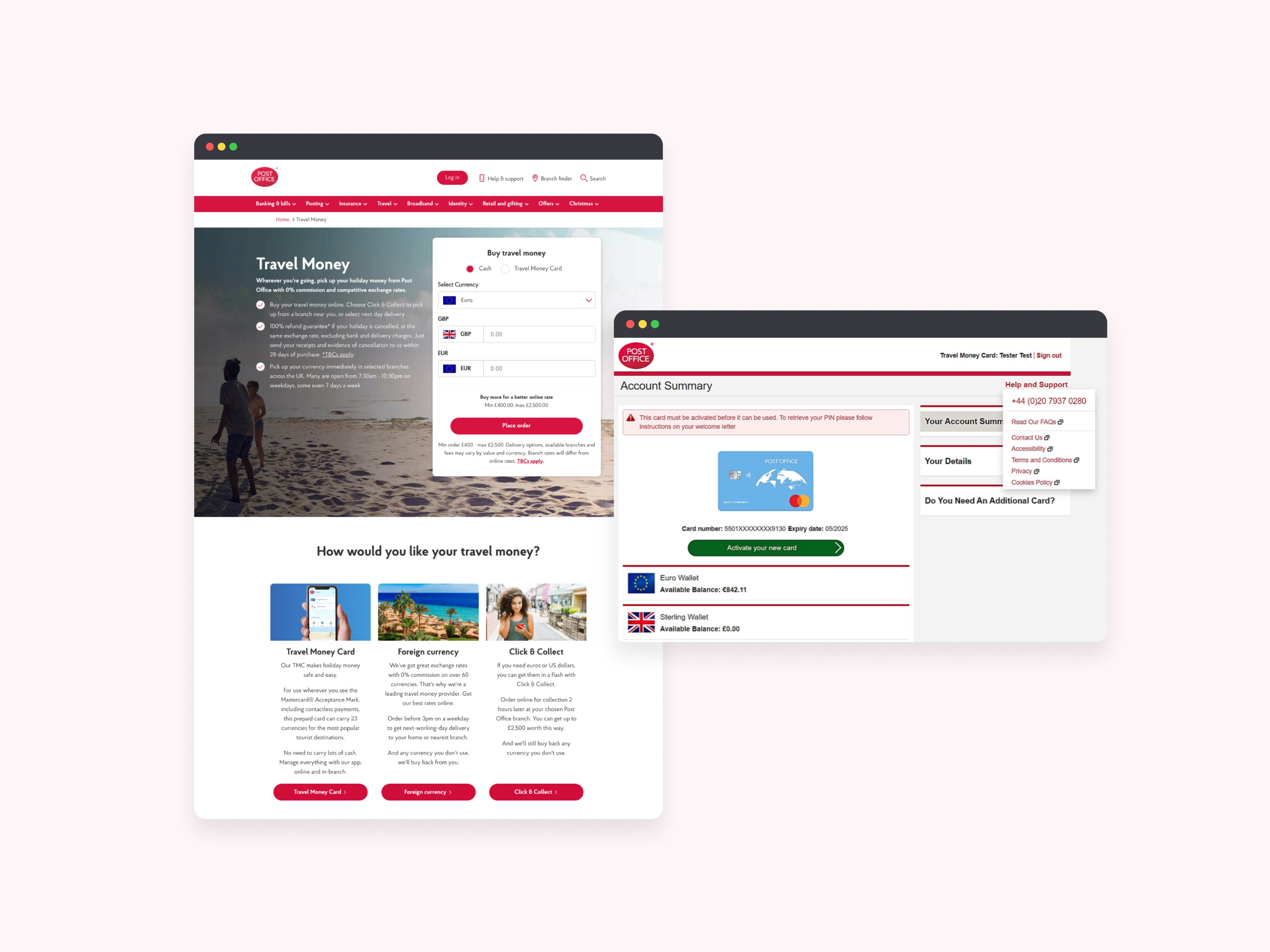
A leaky funnel with a growing bill
Travel Money is one of Post Office's core revenue journeys. But friction across the card order and currency top-up funnel - especially on mobile - was driving users to abandon before completing. 80% of the user base was on mobile. The funnel wasn't built for them. Support queries were climbing, and the cost of that failure was quantifiable: £42k a year in travel-related support contacts that stemmed directly from UX issues.
PROBLEM DISCOVERY
Users weren't confused. They were under-informed and under-supported.
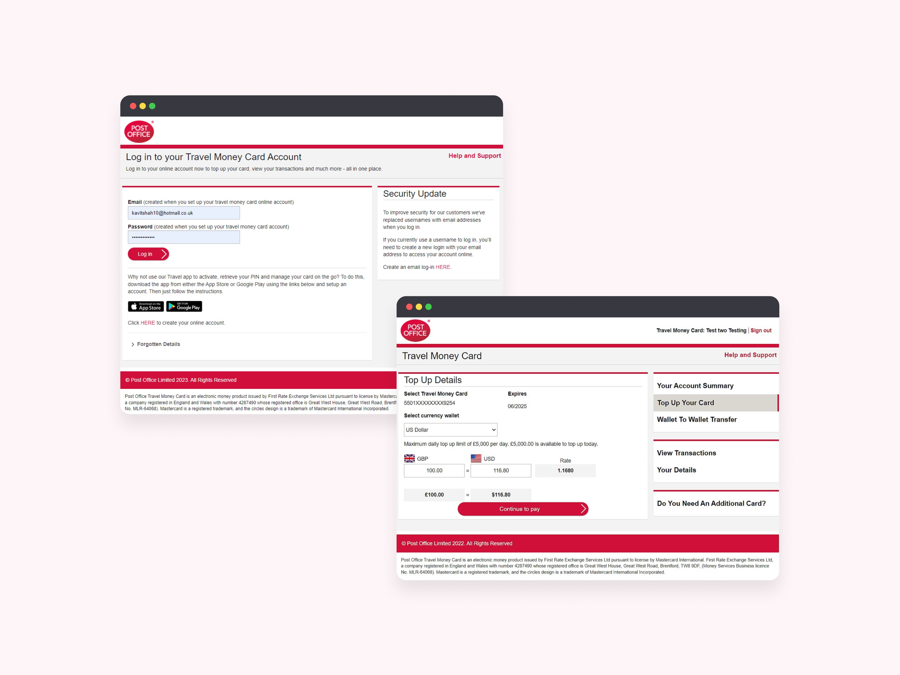
Working with a senior user researcher, I mapped the funnel against session data and user feedback to identify where and why users were dropping off. The pattern was consistent: users were hitting critical decision points - delivery timelines, fees, ID requirements - without the information they needed to commit. On mobile, the problem was compounded by an inconsistent, unresponsive UI that made the funnel feel untrustworthy.
The core issue: the funnel asked users to make high-stakes decisions without giving them the confidence to make them.
THE DEAD END
We asked users which version they preferred. The answer wasn't what we expected.
I designed and A/B tested two high-fidelity prototypes with 10 users, all booking currency for upcoming travel:
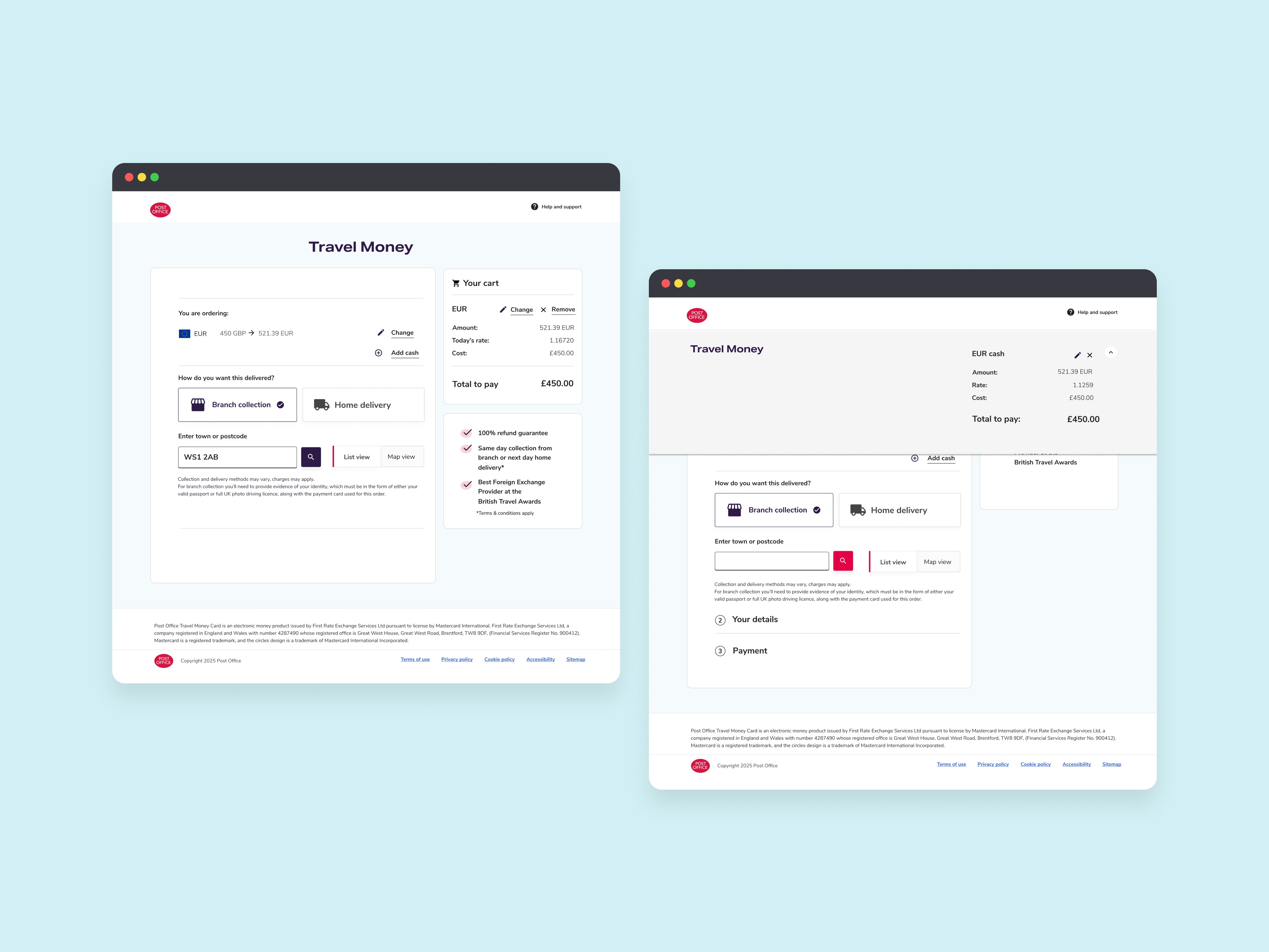
P1 - persistent, editable cart visible throughout the funnel
P2 - collapsible cart at the top with a summary at checkout
The assumption going in was that P2 would feel cleaner and less cluttered. Users disagreed. P2 caused backtracking and missed critical details because the cart was hidden at the moments users needed reassurance most. Reducing visual noise had reduced confidence instead.

SOLUTION
Keep the cart. Make it earn its place.
P1 won - but the insight wasn't just "persistent cart beats collapsible." It was that users in a financial transaction need continuous visibility of what they're committing to. That principle shaped every decision that followed.
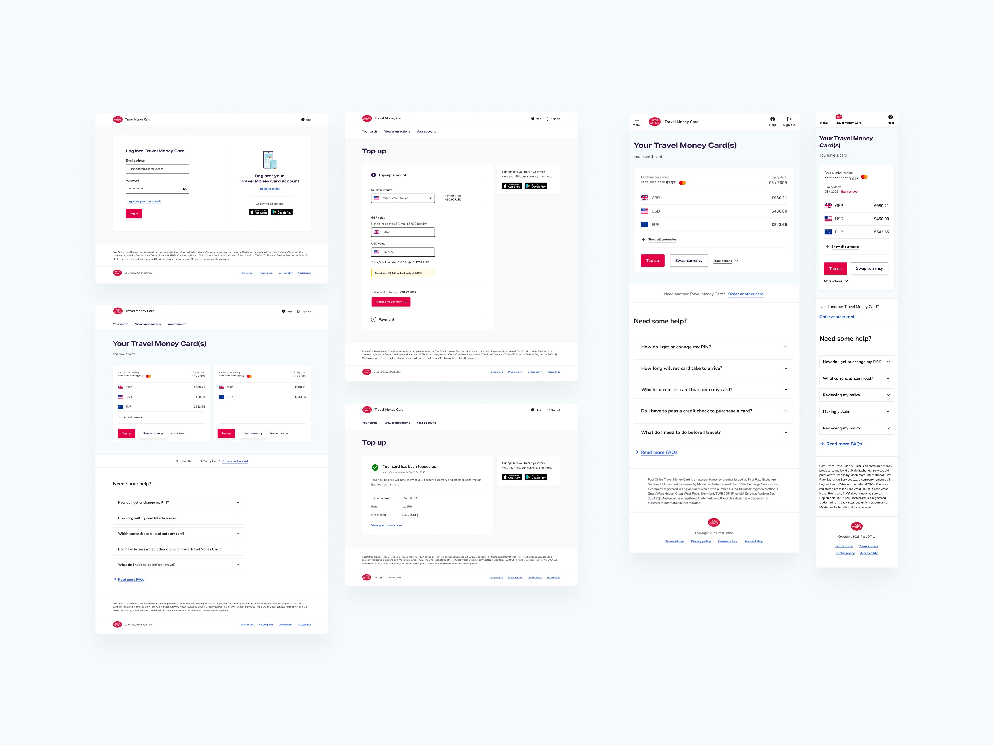
The persistent cart became the backbone of the redesigned funnel - editable, responsive, and visible at every step across both desktop and mobile. Around it, I rebuilt the delivery and collection sections using radio buttons that met WCAG 2.2 standards, restructured the information hierarchy to surface fees, timelines, and ID requirements at the right moments, and worked with the SEO team to rewrite confirmation copy that had been consistently raising doubts at the point of conversion.
Third-party dev constraints shaped the build throughout. Rather than treating them as blockers, understanding them early gave me the room to push the design further within what was actually achievable - and meant the handover was clean.
Each component shipped with full Figma documentation and dev-ready annotations. The persistent cart pattern was adopted directly into other product funnels including Passport and Branch Pickups.
IMPACT
Fewer doubts. Fewer drop-offs. Fewer support calls.
↑22% Funnel completion following the redesign
↓30% Support queries - saving approximately £3-4k per month in avoidable contact costs
The persistent cart pattern carried forward into Passport and Branch Pickup funnels, making it one of the most reused components to come out of the project.
REFLECTION
Constraints are a design brief in disguise
The third-party dev constraints on this project could have shrunk the scope. Instead, understanding them early meant I could design right up to the edge of what was buildable - and nothing got cut in handover. The same discipline applied to the research: testing two real prototypes with real users under time pressure gave clearer direction than any amount of internal debate would have. When you have a deadline, good process isn't a luxury - it's the fastest route to a defensible decision.