Travel App redesign for Post Office
The Post Office Travel App was underperforming across its two core revenue journeys. I was brought in to shape what shipped - and it contributed £770k in Travel Insurance revenue uplift.
Product Design
Visual Design

2022-2024 | Snr. Product Designer | Post Office
THE CHALLENGE
One app. Two journeys. Neither converting.
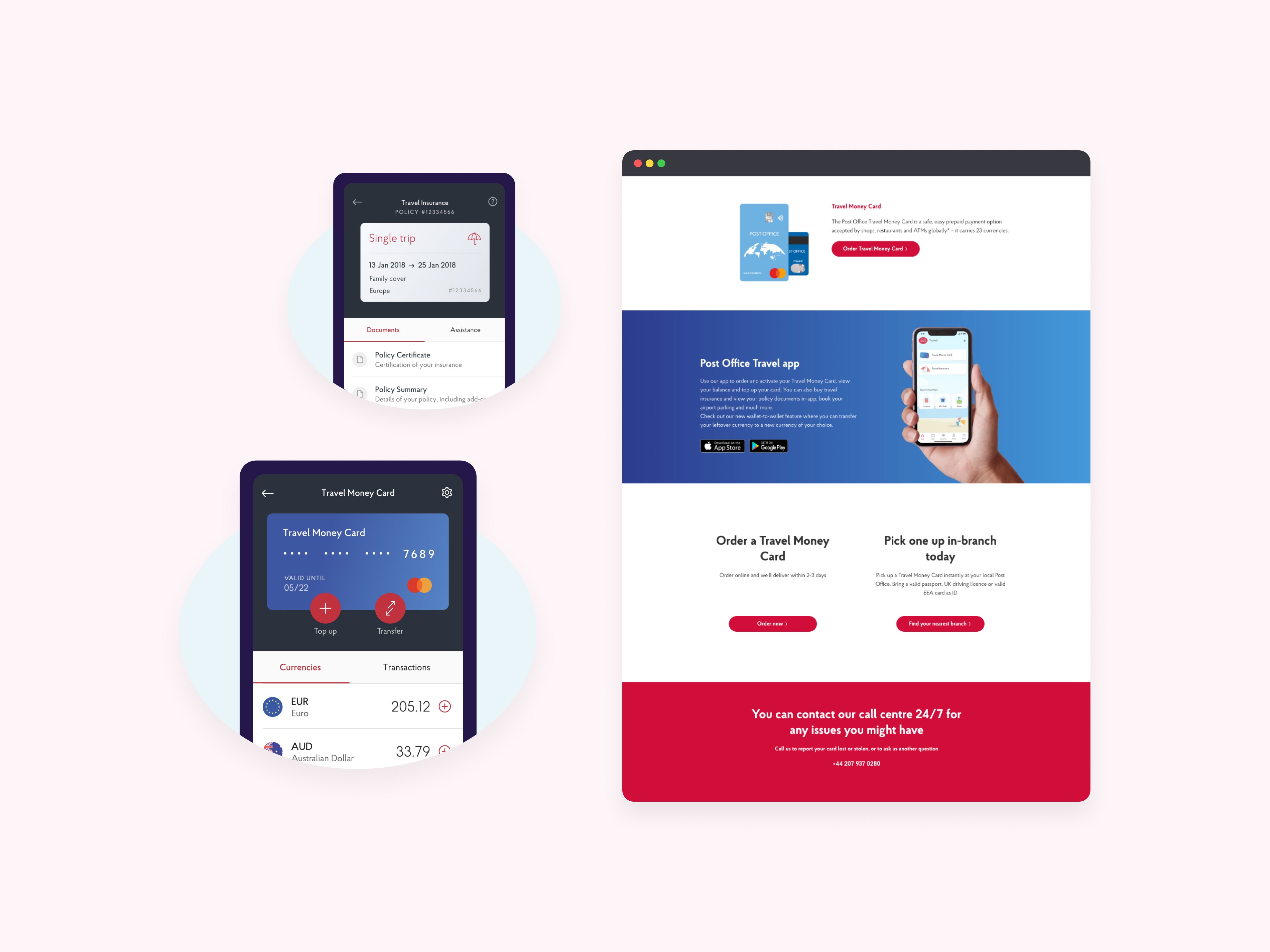
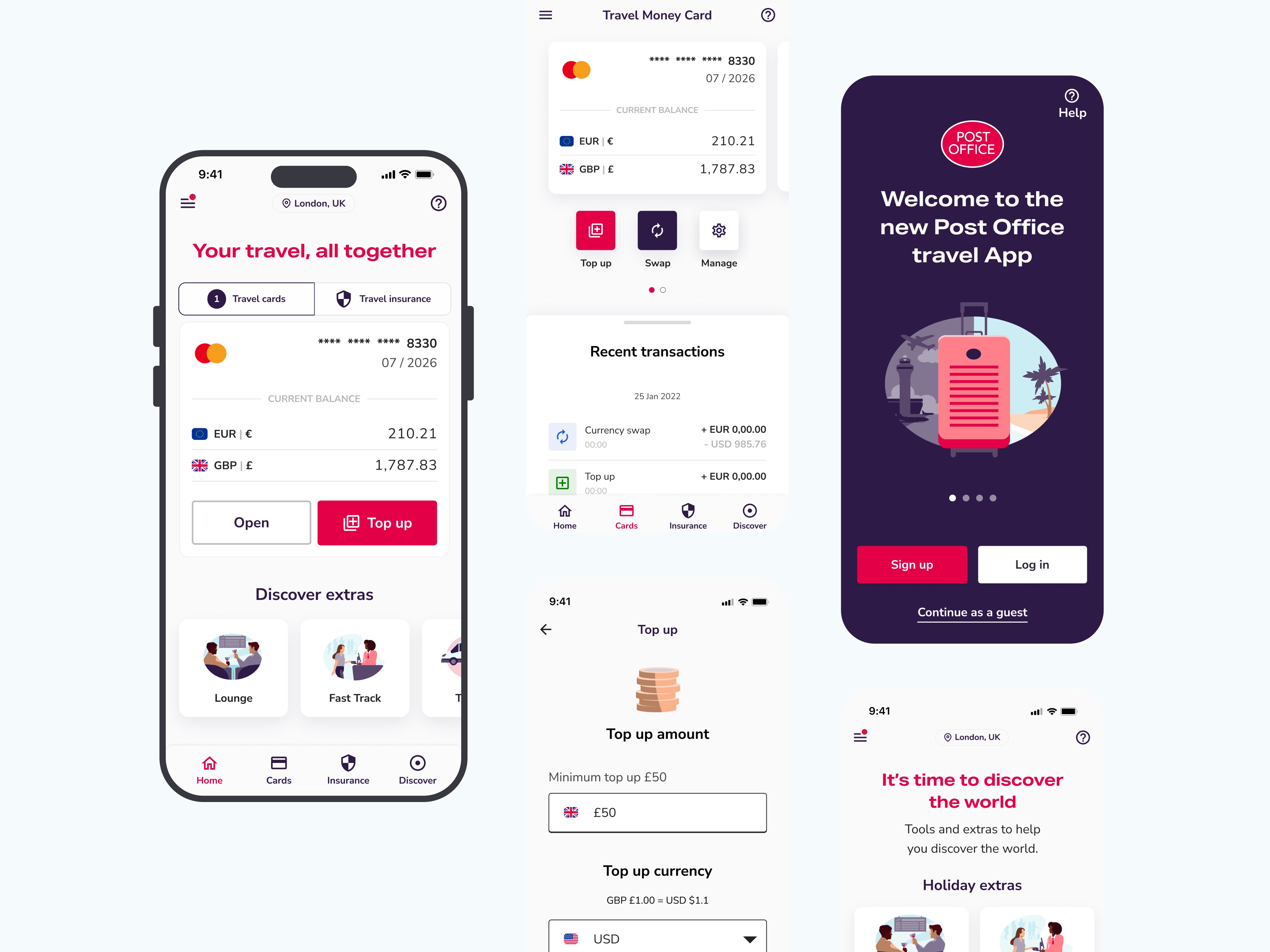
The Post Office Travel App was the intended one-stop-shop for Travel Money Card top-ups and Travel Insurance quotes. In practice, users weren't completing either. Drop-off was highest at the moments that mattered most - the start of registration, mid-funnel on card ordering, and before confirming an insurance quote. The app had the right ambition. It didn't have the trust of its users.
PROBLEM DISCOVERY
Nearly there isn't good enough when money is on the line
I joined as UX proxy for Post Office, working alongside a third-party design and development team with authority over what shipped. The UI foundations were in place - but the details that drive conversion, hierarchy, confirmation logic, accessibility, interaction feedback, weren't landing consistently.
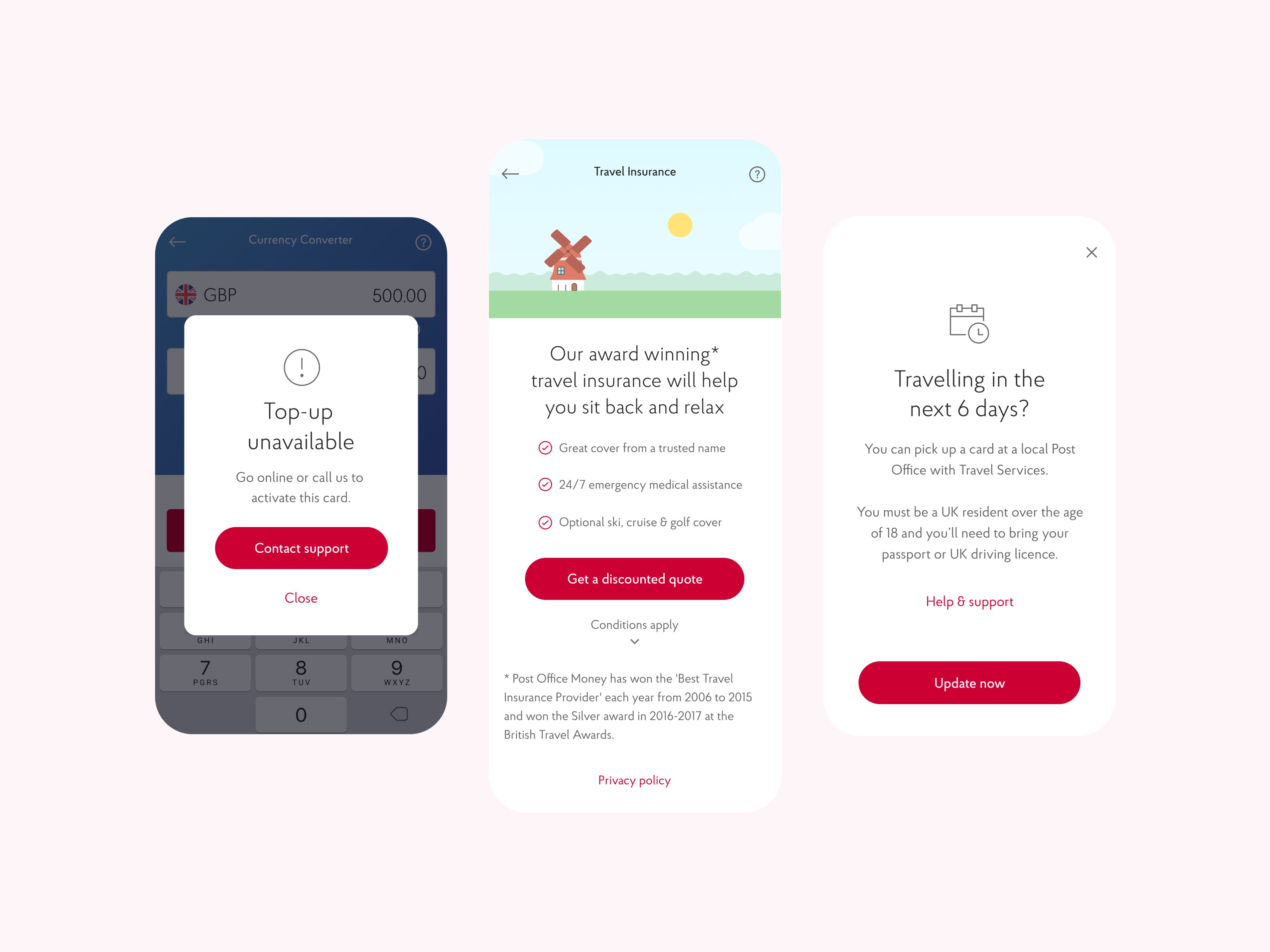
User testing across 12 moderated sessions, conducted alongside our senior researcher on UserTesting.com, made the gaps concrete. Insurance users couldn't orient themselves in longer quote flows - they didn't know what step they were on or what they were committing to. Travel Money users were abandoning top-ups because the flow had too many steps and too little feedback at the moments that mattered.
Both journeys were asking users to make financial decisions without giving them the clarity to feel confident making them.
THE DEAD END
Cleaner screens didn't automatically mean clearer journeys
The early focus was tightening the visual design - cleaner layouts, more consistent components, better brand alignment. Necessary work, but testing showed it wasn't sufficient. Insurance users still backtracked. Top-up users still dropped off. Visual consistency had improved the app's credibility without fixing its usability. The problem was structural, not aesthetic.
SOLUTION
Design authority at the point it mattered most
My role was to own the decisions between design and ship - reviewing, directing, and approving changes across both journeys before they reached dev handover. That meant catching structural issues early and having the authority to redirect rather than just comment.
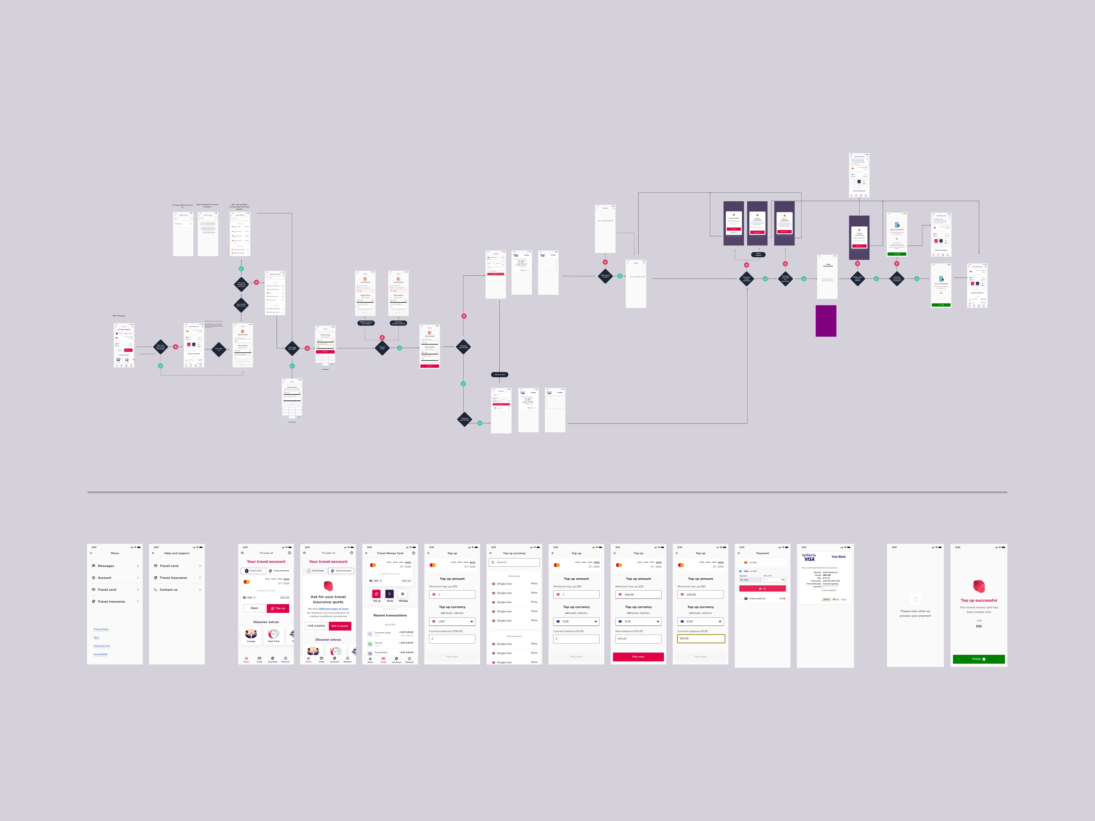
For Travel Insurance, I redesigned the quote and confirmation flows with a step-based structure, visible policy breakdowns - excess fees, cancellation cover, key terms - and clear pagination so users always knew where they were and what came next. Summary screens before confirmation gave users a moment to orient before committing.
For Travel Money Card, I simplified the top-up and swap journeys by removing redundant steps and reinforcing key actions at each stage. Input, confirm, complete - with consistent feedback throughout.
Both journeys went through a full accessibility audit - improved heading structure, contrast, field grouping, and button placement - which directly improved task completion on dense screens like registration and card order forms. New features including guest login were reviewed, iterated, and approved through the same process.
Every component shipped with dev-ready Figma specs and interaction documentation. I supported QA through to launch, timed ahead of summer travel demand.
IMPACT
Two journeys fixed. One app people came back to.
£770k Travel Insurance revenue uplift following the redesigned quote and confirmation flows
+14% Click-through rates across card order and top-up flows following accessibility and usability updates
1.7M Travel Money Card top-ups - 11% increase year on year since launch
+7% Average daily users post-launch across Android and iOS
REFLECTION
Authority without ego
Being brought in to shape someone else's work - with a third-party team and a hard launch deadline - meant every decision had to be defensible and fast. The most valuable thing I could do wasn't redesign everything. It was identify the highest-leverage changes, direct them clearly, and make sure nothing that undermined user confidence made it to ship. Knowing when to redirect and when to approve is a different skill to designing from scratch. This project sharpened it.