Web redesign for Post Office Ltd
Post Office's product pages were losing 40% of users before they converted. I found out why - and fixed the system behind it.
UI & UX
Design Systems

2022-2024 | Snr. Product Designer | Post Office
THE CHALLENGE
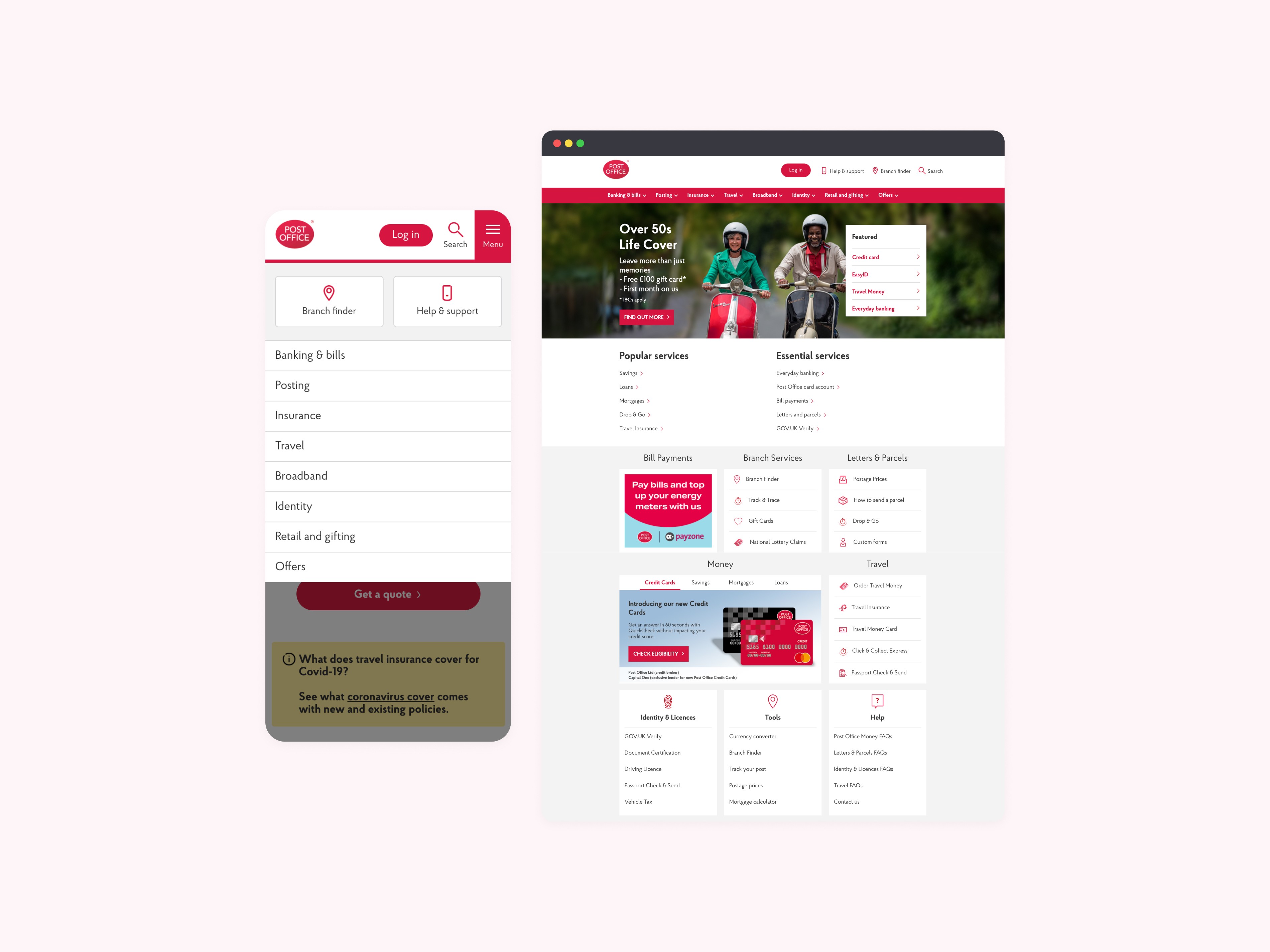
Nobody told the website what it was for
Post Office's web estate covered Travel, Insurance, and Mails - each managed by a separate content team, each drifting further apart. Product pages had grown inconsistent, navigation was unpredictable, and conversion funnels were underperforming. On pages like Travel Insurance, over 40% of users were leaving before reaching a single CTA.
PROBLEM DISCOVERY
The pages weren't broken. The system behind them was.
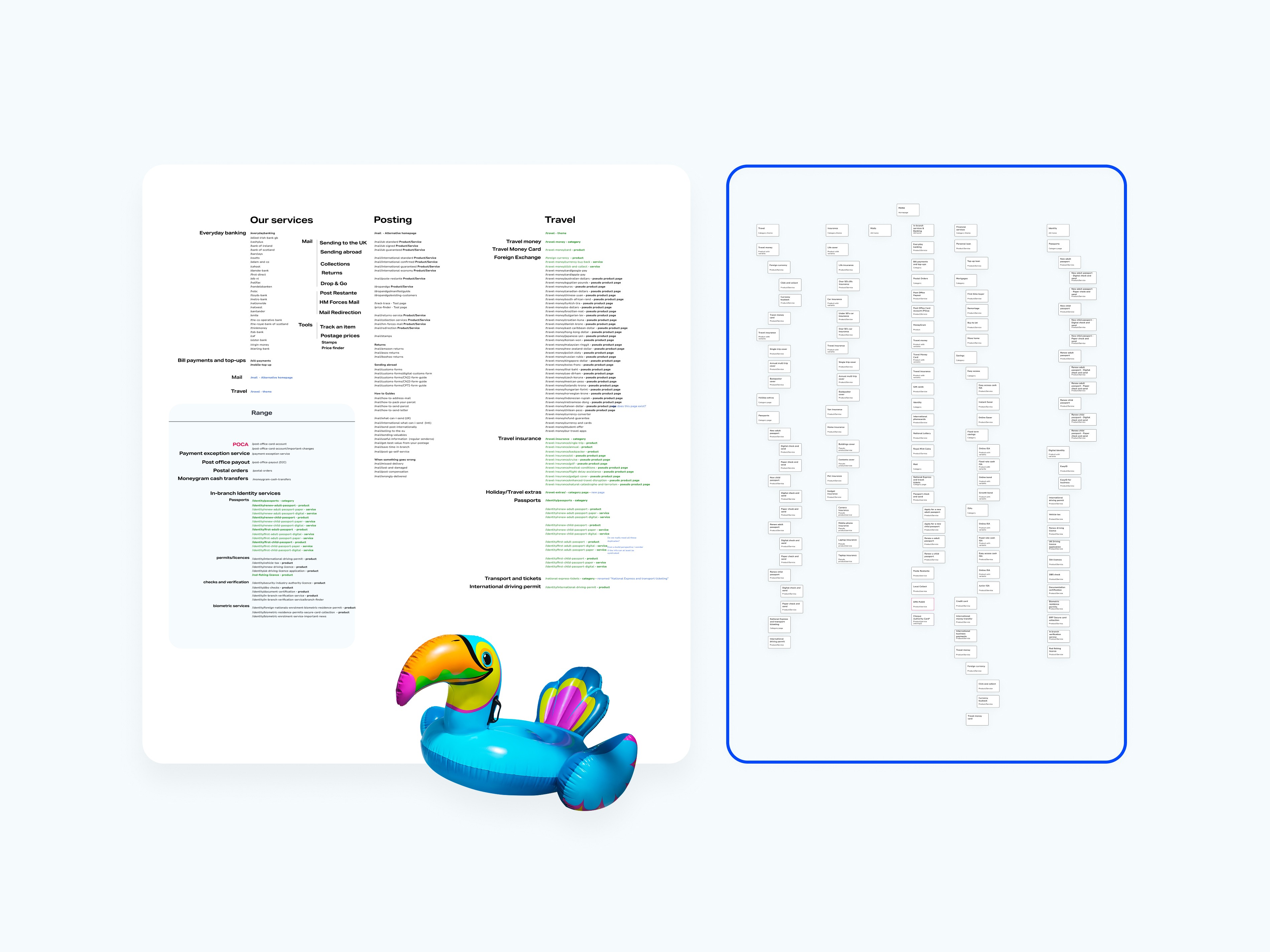
Working alongside the UX lead, I audited the IA across Travel, Mails, and Insurance - mapping drop-off points against the content decisions editors had made on each page. Moderated usability testing and session recordings confirmed what the data suggested: users were losing orientation mid-page, skipping tab content entirely, and abandoning journeys before converting.
Looking upstream made the cause clear. CMS editors had no reliable guidance on which components to use or how to structure content for different user goals. They were duplicating outdated layouts, abandoning tab modules mid-build, and padding pages with copy because nothing in the design system told them otherwise.
Every page was a judgement call made without a framework.
THE DEAD END
More content made it worse
The response from content teams was to fill the gaps - more FAQs, longer tab panels, additional explainer copy. Testing showed the opposite effect. More content without hierarchy meant longer scroll paths, higher cognitive load, and users who couldn't find what they needed. The content wasn't the problem to solve. The structure was.
SOLUTION DISCOVERY
Stop designing pages. Start designing the system.
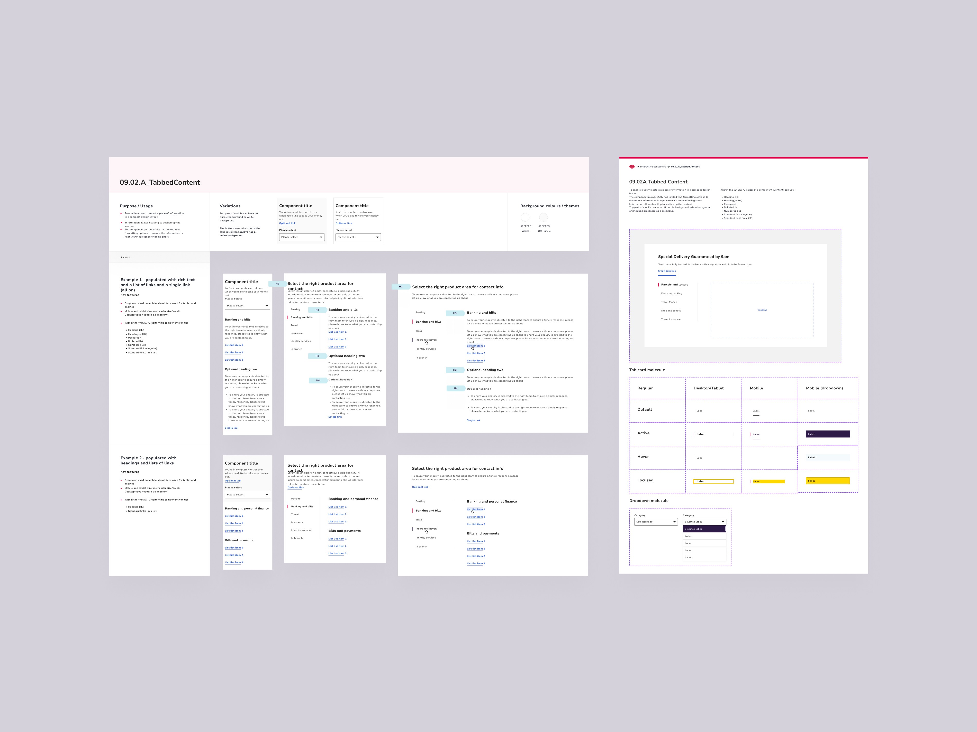
The audit pointed to three recurring failure modes across product landing pages and conversion funnels: comparison content buried in unstructured prose, primary CTAs lost below the fold on mobile, and tab modules applied inconsistently - wrong content types, broken mobile behaviour, and failing screen reader support.
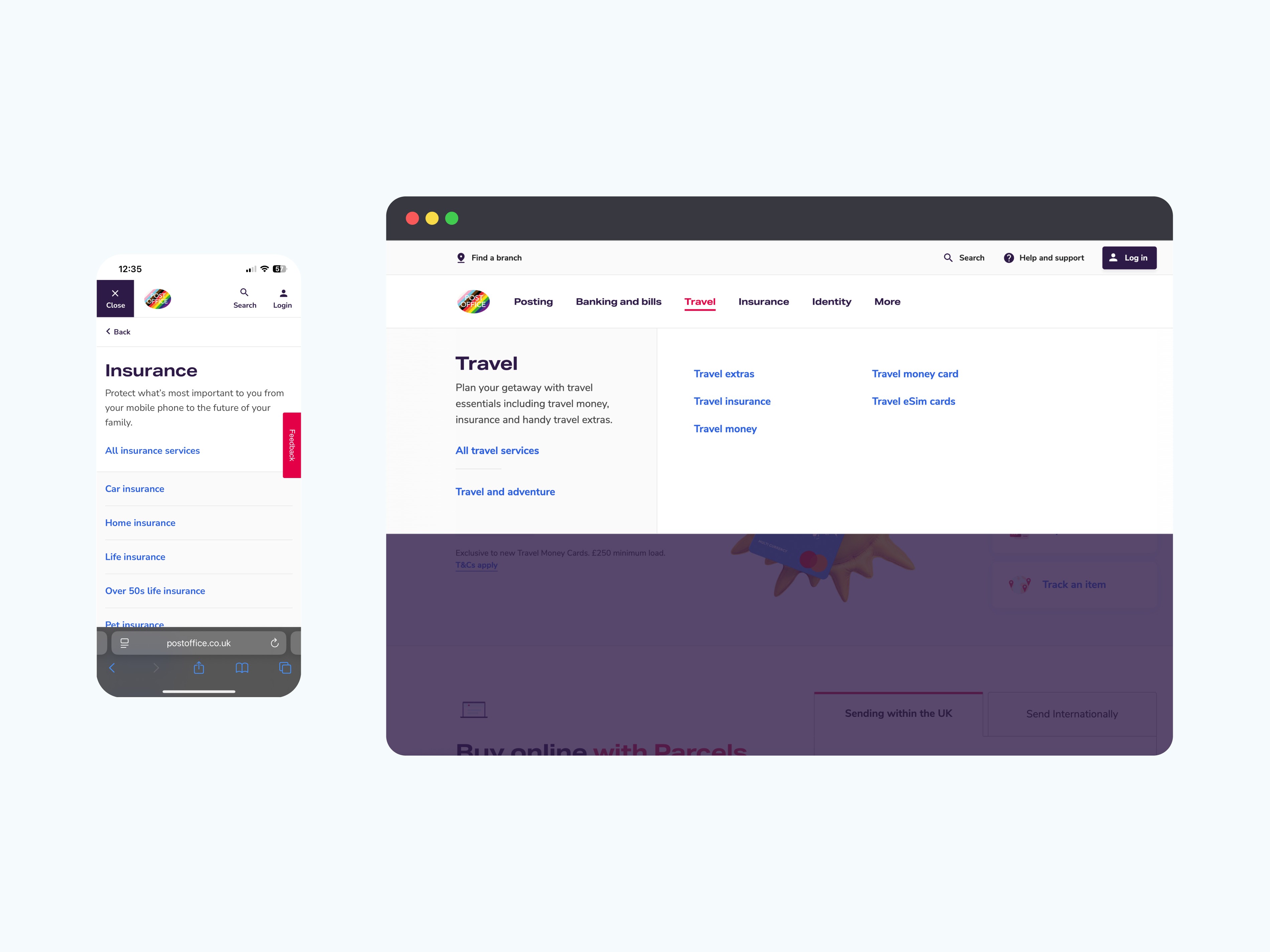
Rather than redesigning pages individually, I rebuilt the underlying components. Tables were standardised for fast scanning and product comparison. Tab modules were rebuilt for mobile performance, keyboard control, and WCAG 2.1 AA accessibility. CTA patterns were made consistent across funnel entry points.
Each component shipped with Figma documentation and usage guidance. I ran walkthroughs with dev and content teams so editors understood not just what the components looked like - but when and why to reach for them. For the first time, the design system had a clear answer when someone asked "what should I use here?"

IMPACT
The numbers followed the clarity
↓25% Drop-off on Travel Insurance pages following the redesign
↓40% Fewer dev and QA rounds per page - less back-and-forth, faster publishing across Travel, Insurance, and Mails
Patterns adopted across product landing pages and carried into early-stage products including Life Cover and Branch Finder.
REFLECTION
The design problem was a communication problem
The components were never the issue - they were being misused because nobody had defined what correct looked like. Getting into the content team's workflow earlier, before layouts had diverged across dozens of pages, would have surfaced this faster. Documentation isn't a handover task. It's part of the design.